The Art of James Teeple

My photo
Leicester, United Kingdom
I'm 21 / DMU Art Student / British-American.

Thursday, 3 January 2013

Visual Composition

Visual composition is a very important subject to study and try to master as early on as possible, because good composition often makes a good image. I admit that I need to practice consciously being aware of this! and also begin to familiarize myself with the terms used within analysis of an images composition. If i understand how critics or other artists analyse a illustration, I can tailor my art to focus on improving my use of these principles, then I can create better images. Simple as that, so lets jump in...
Composition can be quite a complex nut to crack and when you do try, your not always sure what is waiting for you inside because there are many different rules that can be utilized to different affect; so I wont talk about them all.
Generally one of the main rules most artists use as a guideline for composition is the rule of thirds.


I remember my art teacher attempting to teach me about this in high school, which by the sounds of things is quite a rare occurrence. Back then I was the sculpture kid, so I didn't pay too much attention to it...

The idea is to divide your canvas into a three by three grid, giving you nice equal parts. You would then place the focal point and sub focal points at the intersections of this grid to help generate a more interesting picture, its all about how your eye interacts with the information withing the boarders of the canvas.
As a novice with no understanding of this rule, you might often center focal points in your image, but this rule breaking is usually considered a bad thing; if your subject is in the middle of the image, it’s considered static. Your eye is drawn to it but then has nowhere else to go from there because the object is equal distance from all sides.
However, it can be used effectively in certain cases where the artist knows when best to break the rules, such as when emphasizing balance or symmetry.
David Peterson from digital-photo-secrets.com thinks "Rules that are broken for a good reason often make the best works of art. It shows that the creator took time to understand their craft in such a way that they can bend the rule. That’s a true artist."
In his article he discusses why the rule of thirds works and tell a little bit about its history, pretty interesting.

For those seeking to critique another painting and understand what makes and illustration work or not work, there are several terms commonly used amongst visual designers to understand that question and ultimately break down composition, finding out why an image may impact you as much as it does and how to repeat that affect in other works.

I found an interesting tutorial that attempts to outline these terms and show how they are used by, analyzing old masters paintings and seeing how these principles were utilized to effect.


In the video the lecturer basically outlines these terms or principles, and how they can be used to to great effect in an image.

Hierarchy - The arrangement of structured importance in an image - So you want to place your focal point at the top of the hierarchy, and make sure that order is not confused.

Rythm/movement - The position and spacing of objects to create a sense of movement. I.e giving the impression that objects are literally moving within the 2D plane or it can be talking about stimulating the movement of your eye over the canvas. This is a deeper subject because with the tools you can apply, you can control the kind of eye movement you want to viewer to use when viewing your image. Be it a slow meander around the page as the lecturer goes on to explain, or a harsh zig-zag from from point to point.
Variety - An artist should aim to include elements with different characteristics, lacking uniformity - because we find uniformity boring to look at. The variety does not need to be bold however, for example it can be best served subtly when emulating nature.

Unity- a feeling of wholeness in the image, when all the elements exist in harmony with the vision of the image making it all feel like it belongs there. It can be used intentionally, for example when a large character is placed amongst small surroundings, it can help make that character pop out.

Balance- Even distributions withing the image plane, while retaining the necessary hierarchy thats been established.
Lines - markings or edges creating strong directions, curved or straight. vertical horizontal and diagonally.
Contrast - Opposing ideas used together to add interest; here are some examples to think about that were provided in the video -
Tonal(light vs dark)
Edges (soft vs hard)
Colour (warm vs cold)
Shape (round vs square)
Line (curved vs straight)
Scale (small vs large)
Detail ( heavy vs light)
Alighnment (good vs evil)
structure (simple vs complex)

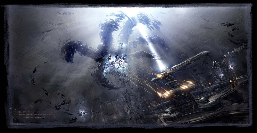
Thinking about shape and scale, one rule that uses these well is the rule of Framing. This rule basically makes use of objects to provide a natural frame for your focal point.


Such as objects in nature like trees, archways, mountains, clouds and holes. If you place these around the edge of the composition it helps isolate the main focal point in the hierarchy fro the outside world. Effective use of this often results in a more focused image that draws you eye naturally to the main subject of interest. This can be quite difficult to achieve, but when done right it is very striking.

Thursday, 6 December 2012

Baby steps in Zbrush

Ive always wanted to give Zbrush a go ever since seeing some of those crazy high poly characters and creatures posted on art forums. It looked like the perfect outlet for me to practice my passion traditional sculpture, minus the mess and plus the bonus of its application uses.

So I've managed to get a copy and give it a swing... Let me just say, It only took 5 agonizing minutes of confusion and ineptness for me to realize this wasn't so simple as pick up and play. Be it that everything in the interface was alien to me, even the shortcuts; I decided to ask for some help. The next time I took a swing at Zbrush I was mildly prepared. I could at least load a Dyna-mesh sphere into the scene and start manipulating it with the brushes, but that know-how was pretty much sitting on the edge of the shelf when it comes to my Zbrush knowledge.

This is what I managed to produce before and after I made it crash... It took roughly 1 hour to shape from a Sphere. Done from imagination.

The Founder! my first Zbrush creation.WIP 1 hour
So as you may imagine, I have been slightly buzzing after managing to get that far, and I'm not  too displeased with my monkey alien man thing either...

My second attempt wasn't so lucky. It just crashed and was lost to the forgotten Zbrush pages of history. Unfortunately I didn't manage to recover a back up save like my first attempt. But I did grab a screenshot of it before the window closed though. This was done in roughly 35 minutes and just head doodles.

Weird Alien head lost at WIP stage.
 
Here is another I'm currently debating working on farther or not. Its a simple Shape that took about 5 minutes to make so either way; no biggie.


5 minute WIP- Base for sculpt
What have I learned about Zbrush then? Well... It is a lot of fun. Once you push past the initial road block of " omg ok.. what do i do?" its easy peasy to allow my thinking brain to switch off and my sculpting creative mind take over. I imagine once I become more confident with the program, sculpting something that puts these to shame will become almost thoughtless. I cant wait!

Why do I want to do I want to learn Zbrush?  Because I want it as another tool under my belt to use as an artistic outlet, or for creating and retopologizing in game models or high poly renders. All the cool stuff that's done these days.

Monday, 3 December 2012

Artist Study - Yang Qi

This is just a guy I stumbled across while trawling CG hub and wow, I am blown away...
So Yang Qi is a concept artist working in the video game industry in China, naturally. The he's most recently worked on is Asura Online, a Chinese game but it looks pretty cool. If only I could read the language then I could navigate their site. >.< Born in 1985, he's only 27 and producing what I'd say is, some of the highest quality illustrations/ concepts I've ever seen.


I'm just gonna link some of what I found were the most interesting pieces he worked on. I particularly love his characters... they are freaking awesome no?


I absolutely love how dark and gnarly his pallet is. The Detail he uses in phenomenal. Most of these probably too many many hours to produce and as a concept artist that's unusual that he'd be given so much time. but i can see why, it appears his designs translate almost identically to the in game models and too right. I doubt anyone farther down the production pipeline could come up with improvements on these.


All above work (c) Yang Qi
This is the caliber of artwork that originally inspired me to do artwork at more that an amateur level and chase a job as a professional artist.

If you are interested, here is a link to more of his work - Click meh

One day...


Planning and Concepting


Concept art! probably the most aspired too and most competitive position in the commercial media industry for any new and budding artist like myself and gristly veterans alike.
"Why" I hear you say? well like my friend Mike said his friend Mitch said his buddy said,


But seriously I think its partly because good concept artists are highly sought after, but the positions available are sparse. Due to their role in the production pipeline and their base skills, you don't really need more than a few in a big company. And everyone is chasing the big bucks salary of course. :P

One thing all artists like is freedom to explore their own idea's or visual style.  I think that's sort of what concept artists get to play with, they get presented the brief and have the responsibility but also freedom make it their own and create something visual that other people like the 3d modelers then have to base their work on.

There are some very important guiding principles that any artist aspiring to the job position of concept artist needs to live by; they are as follows:
First and foremost it almost goes without saying that you've  gotta have a firm grasp of the fundamentals that underpin any artwork. Such as, Anatomy, perspective, colour, tone, lighting. That is what I'm constantly working towards mastering.

Without those you really cant stand a hope in hell of producing any kind of artwork someone today would pay you a salary to do.

Planning - Now I'm not great at planning and that's something I'm working on changing. I'm too used to skipping ahead and following my initial idea till Ive either completed it or given up mid way cause it wasn't before good. Where as if I planned my idea and intelligently managed my time developing it before committing all my resources to it, then I'd likely end up with a better result.
I need to experiment more and stop thinking I can nail it on the head with my first shot. So planning is essential to concept art and not just that. It helps you to keep to a schedule, know your time realistically so you can maintain a healthy work ethic, whilst not neglecting other aspects of your like. e.g. healthy lifestyle.


Design -  Basically, if its lame you no get moneys or job. So be smart about it, creative and concise with what your aiming to get across. Their job is is to translate an idea into something that is unique, that is visually pleasing and makes sense to the next guy to the line. Sooo now I need a good example and a bad example of Design.
These in my opinion are good examples of conceptual design,


All above artwork by John Liberto / Concept artist
The artist has clearly mastered the fundamentals and can then harness creative design in a professional manner. The images give the viewer a lot of information without flooding you with it. there are real world references that anyone can instantly pick up on in the designs and it gives them a solid foundation, and a world to exist in. Like Car racing stripes, sky scrapers and space shuttles. etc.
Technical ability and skill - Now you cant achieve the above without this. It is something that is earned from thousands of hours of hard grafting and constant pushing forward of idea's and techniques. Its not something you are born with... Although to some extent I would say it can be. because there are some people who naturally find their in tune with this kind of creative process and more often then not, those people end up focusing on art over traditional academics because its identified early on. With hard work anyone can become technically good though, and gain the skills needed to create this kind of imagery. 


George Hull / Concept Artist

However, being creatively brilliant is another matter. That usually is something you either click with or you don't. Some people were born to imagine amazingly quirky creative things and others just arn't...
I like to hope I am not one of the latter, I just need to graft and get the fundamentals nailed before i can unlock that hidden potential. :D

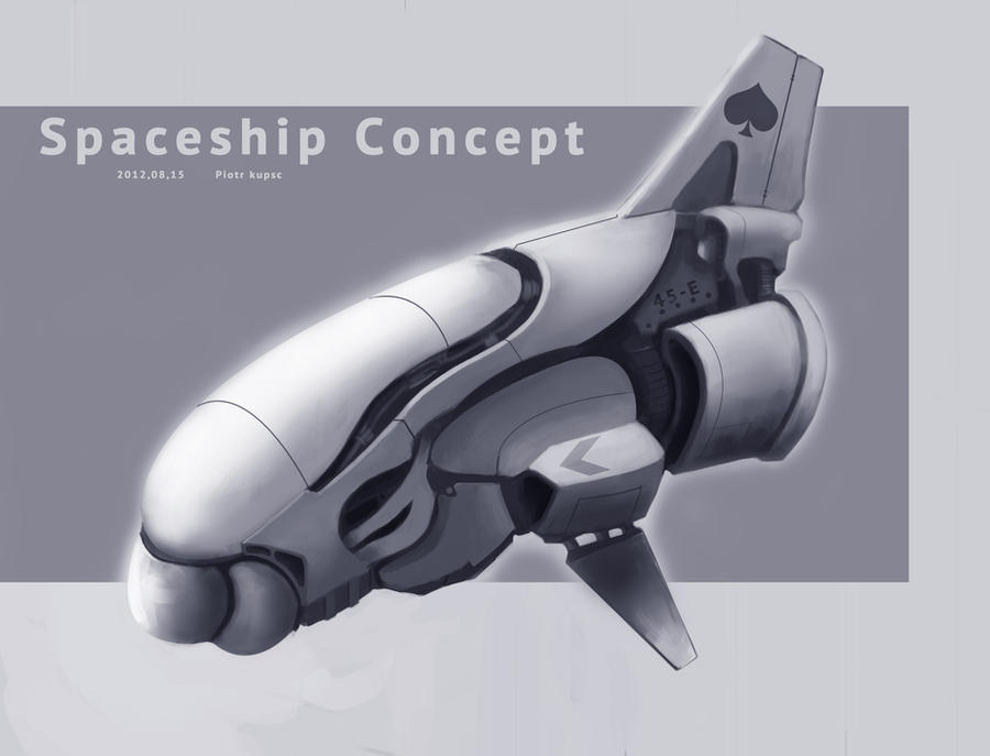
Functionality - Your design has to look like it could work/exist ! No point designing a space ship that's totally smooth and has no visible windows or obvious entry location. Unless its a UAV or has some kind of future tech that teleports the pilot into the craft, in which case that needs to be explained visually some how. Best avoid needing to talk too much and just let the pictures speak for themselves.

I don't want to be harsh to the artist, but here is an example of a slightly confusing concept. In which its functionality is stylized so much its almost not based in reality.


DA / ST-Pete
Time/ Speed- Time is constant, speed is variable. A good designer will utilize their time by maximizing their speed and work efficiency. Time to crank up the gass! Once you realize that the time you have in a day always stays the same and the only way to maximize learning is to increase the speed at which you work, that's moving forward. I must seriously work on this, because my problem is simply taking too much time doing too little, and its not worked too well towards what I aim to achieve.

Adaptability- This is hugely key and is a major factor in a company when deciding to hire a new concept artist. Basically you have to be able to adapt to different styles and subject media equally as efficiently as your other maybe more favored work. So if your needed to do some designs for a game based on the great barrier reef, and you are also great at doing vehicle designs etc.. your more likely to get the job than Mr "one trick pony", even if he/her is technically better at their preferred subject.

It also means being able to work in both 2D and 3D mediums. This is something I am training to better myself at, because I'm aware I have favored subjects I draw, but the more versatile I can be, the better ill be. John Liberto is a good example of an adaptable concept artist. Jaime Jones is another. There is a reason they have both worked with the big fish on the games industry scene.

Jaime Jones / Concept Artist
Contextual knowledge - Its a good idea to have some knowledge of the industry your heading into, you know... never hurt. And while brushing on your computer games history, you'll likely come across resources stock full of artists who could prove interesting to study, or even influential. That's what happened with me, Ive come across many different artists who have inspired me along the way, through simply researching a particular game I liked just to see who work on it, etc.

Vision library - This is something i need to work on, because apart from a vast desktop wallpaper folder, I have very little images of my own gathered through collection. I want to aim to have gigs and gigs of imagery to reference from by the time I get my first job as a professional artist. The wider the themes encompassed in it the better!


Sunday, 2 December 2012

War of the worlds

 Its 1938 and Aliens from mars have invaded American soil vaporizing human resistance and spelling inescapable doom for man kind world wide! ... or at least that's what some hundred odd new yorkers thought was ACTUALLY happening when Orson Welles performed his radio dramatization of H.G. Wells' novel The War of the worlds live on the radio on Halloween.
It caused quite a big stir...

Now some 74 years later, I'm re-imagining the story and telling the story of the Alien invaders from my own artistic viewpoint. Fun fun!
So for some reason I found it quite tasking coming up with a tripod design that interested me.
I resorted to just doodling some organic and non organic shapes and applying them to a 'tripod' format. These are some examples...


By the time I reached this last sketch, above, I decided I quite liked the curves and flow of lines. It ended up serving as the main design for my 'quadruped' because you see the original alien craft weren't actually tripods, the hovered. So I took that artistic license and decided on four limbs. This is a render of my alien craft in a scene.


With this drawing I wanted to 'loosen up' my lives and marks a little bit. I decided to go quite rough and angular with my mark making techniques with a mix of soft and subtle to break up the image. So far I've only done a grey-scale version of this but I may add colour to it when I have the time.
I'm not all too majorly pleased with it but its fine for now.
Gets my design across well enough I feel, and I wanted to do a rural wilder scene to host my quadruped craft as opposed to stereotypical cities.